Ghosts and Spirits Tarot Review

GaSTR (4)

Ghost and Spirits Tarot by Lisa Hunt

Status: Currently reading with it

Best for: Questions involving spirits, this is a very spirit oriented deck. This is also a great deck for people who love folklore and supernatural or the macabre.

Favorite cards: Page of Pentacles, Two of Cups, Justice

Acquired from and date: 2015. A gift from the lovely from The Lantern Collective. My eternal thanks.


GaSTR (3)


This is a lovely yet complicated deck. This isn’t really the kind of deck that you can simply pick up and use. You’ll need to study it. You’ll need to research it. You’ll need to keep the Little White Book handy. And you’ll probably need to break out a magnifying glass. But it is a lovely deck that can give some truly deep answers – if you’re willing to deal with the various voices that come from it.

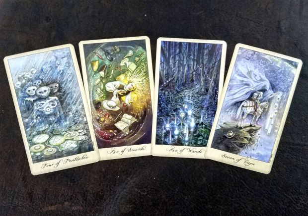
It’s also a varied deck. It has lots of cards with soft, pastel colors and yet somber cards with dark blues, greens, or browns. The yellow-cream border is thin but frames the movement in the cards nicely. The detailed cards has so many lovely colors and that might suggest a gentle tone but in reality, the subject matter and cards themselves are somewhat macabre. This isn’t a deck cobbled together of Casper the Friendly Ghost but pulls stories from mythology, folklore, and even literature.
 

Ghosts & Spirits Tarot by  Lisa Hunt and US Games


There’s a lot going on in all these cards. The art is gorgeous, heavily detailed and yet simplistic in a way. The cards’ imagery isn’t as complicated as they might seem at first glance. This is largely because the art style has a lot of movement in it. It all looks very windswept or as if you’re looking through a veil. That’s likely on purpose, by the way, but it also comes across as the artist’s style.

So breaking out the magnifying glass may be necessary for some cards but you probably won’t miss an important detail if you don’t. Which is good because there’s so much more you need to be keeping an eye on in this deck.

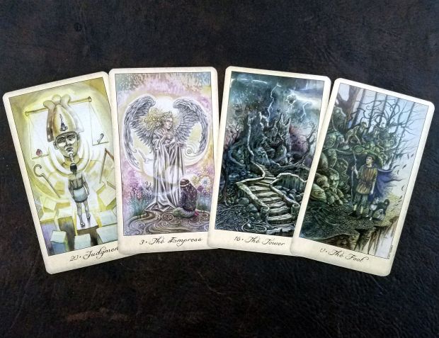
Each card in the deck tells a different story. The Tower card speaks of the Fall of the House of Usher. The Chariot is the Wild Hunt. The Magician is a Psychopomp. The High Priestess is the Sibyl / Enchantress. The Lovers is the Spectral Bridegroom and the Emperor is the Hawaiian Mo-o (Dragon Ghost-Gods). The featured ghosts and spirits are wildly varied. But this also works against the deck because without the Little White Book, you have absolutely no idea what story is being indicated. And if you’re not well-read on all the spirits, you may not understand what nuances are being shared within the card-story combination.  I almost think this may have been better as an oracle deck simply because it would be easier to related to rather than trying to figure out if you should read the cards based on the entities selected, the cards themselves, or some combination thereof.
 

GaSTR (6)


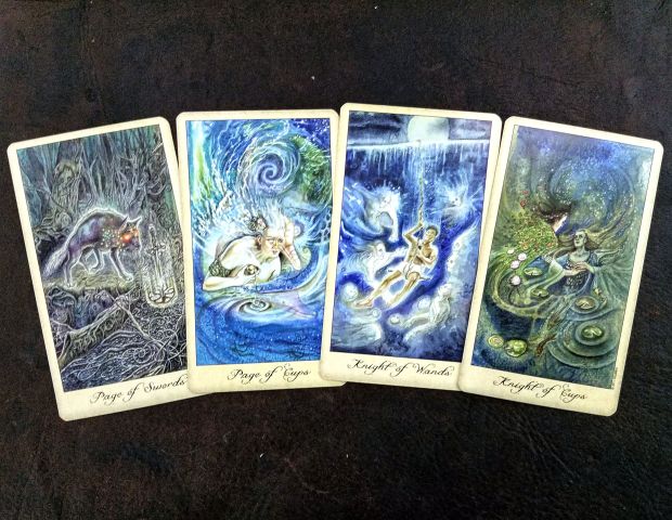
I’m very excited by a deck that has lots of POC or varied content like this. But I think a lot of the POC get washed out in this deck mostly because the color palette or motion within the cards. The figures within these cards often appear small compared to the complex, dreamy backgrounds so if you’re not paying attention, you may miss that the Knight of Wands actually features the Hawaiian demigod hero Hiku. Again, I cannot believe this is not intentional as most of the cards have a lot going on but it’s worth mentioning.

There is one card change and that’s to the Devil card. It’s now the Chains card as represented by Jacob Marley from A Christmas Carol. I’m kind of on the fence about this change because while I love the idea of the Devil as Chains but while Ebenezer Scrooge has the ‘ lots of obsession and addiction until destruction’ theme in spades, Jacob Marley is, ultimately, the catalyst to save Scrooge. The Devil card doesn’t actually promise this. The Devil card can serve as a wake up call but I don’t typically see it used this way? Maybe that’s just me but I think it highlights a major concern for this deck: do the stories actually fit the cards?

Yes, they do but they do it in a way that you might not use the cards as. The subjects of the cards were chosen to represent a specific feature of the cards. Likewise, the spirits and stories are also seen from a specific point of view. Not all the stories are all-encompassing and I believe there are nuances that can be derived from knowing the folklore and stories behind each spirit or subject of the cards. Essentially, you can derive a LOT of meaning just from the card subject as much as you can the card itself. It really depends on how you connect to the cards.


GaSTR (5)


This deck would hugely benefit from a guidebook. The Little White Book doesn’t go into why the author chose each spirit for the cards. You can only try and guess to which story was selected. I have no idea how well Lisa Hunt understands each of the featured stories so how deeply do you look when it comes to the ghosts and spirits’ stories? How far down that rabbit hole do you need to go? I find myself assigning my own spirit or associations to some of the cards and adding another layer of nuance to work with that’s easier for me to understand or works better with the card selected.

Another quirk of this deck is the lettering. The deck as a fluid script for titling the cards and I almost find it distracting. I’m not super fond of fluid script fonts anyway – I find them sometimes hard to concentrate on or read – so this may be my bias acting up but I also cannot see what other font could be used. I think maybe no lettering at all and working out some other means to tell the cards from one another would be easier. Again this would be easier to do if the deck was an oracle rather than a tarot. Or, maybe it’s the yellow of the border that throws it off. I almost think that it would be better white? Nit picky, sure, but it’s one of the things that stands out to me.

A third quirk is the deck back. It’s simplistic compared to the rest of the deck. Three ghosts in a circle. It’s almost odd and quirky compared to the deck. Luckily, the deck back is reversible so that’s a point in its favor.

It has a wide amount of voices. What I mean is that some decks have a unified voice. They all speak together and send a singular message but instead, this deck is like listening to a crowded room. There’s a lot to hear and some days seem “louder” than others to me.  This isn’t necessarily a bad thing but something to keep in mind.


Ghost and Spirits Tarot by Lisa Hunt


LWB inside


Aside from the above, the deck works well. It shuffles as well as any US Games deck. I find the card stock on the thin side but it still feels sturdy. It has held up well over the years I’ve owned it. Sheen and size compare to all other US Games decks – the size is good for shuffling and still keeping that classic tarot shape and the sheen will wear down over time and use. Not a bad thing at all.

The box it came in is your average thin cardboard box for cards. I believe mine became unglued soon after receiving it so I just ended up crocheting a deck bag for it. As said, the Little White Book is a fairly standard LWB but do not throw it away! It is your ONLY guide to what stories or spirits are featured in the cards. In fact, I wrote the stories and spirits down in my tarot journal just because I feared losing it. I took photos too and saved them in a cloud. You can probably get a replacement copy of the LWB online but I sometimes find it difficult to narrow down the stories or spirits represented by the images alone.


Chariot from the Ghosts and Spirits Tarot by Lisa Hunt


I don’t really think this is a great deck for beginners or people who use their cards on the go. There’s just too much deviation to be a standard RWS deck for most beginners to get a handle on. That’s not a bad thing but if you’re trying to use memorized keywords for your readings, you may find that you’ll struggle. There’s also a lot of detail so some folks who have trouble with decks like Fairy Lights or Shadowscapes may struggle here too.

Overall, do I like this deck? Yes. I like it quite a bit and I regularly use it for spirit based questions. I feel that in order to really get this deck, I’d have to devote some serious time to researching the stories and spirits included in the deck and meditate with each card. Some decks require this kind of time and others don’t. I don’t mind that. I would definitely buy it again.


Ghosts and Spirits Tarot by Lisa Hunt © US Games Systems

Review: Oracle of Visions

Oracle of Visions


Oracle of Visions by Ciro Marchetti © US Games Systems

Status: Reading with it

Best for: Everything. This deck loves questions and claims that it can do it all but it is less specific than other decks.

Favorite cards: 20, 30, 40

Acquired from and date: A birthday gift from my father. June 2015.


Oracle of Visions


This is one of those decks that is so beautiful but is less useful than one might imagine. The cards are colorful, bright, and brilliant but do not have a distinctive meaning. You can use them as prompt cards and they’re excellent for a whole host of intuitive usages.

The imagery here is definitely fantastical and reminds me strongly of dreams – some things just won’t make sense in a mundane way. But if you view the card as a dream, suddenly it starts to become more believable.

There are 52 cards in the deck and, while keywords and descriptions are given in the included book, the cards are numbered. This encourages you to come up with your own meanings for the cards.

Quick note, my images are darker and fuzzier than the cards are themselves. It’s really hard to get photos of just how beautiful this deck is without perfect lighting. My photos do not do this deck justice.


Oracle of Visions


The artwork is, without a doubt, Ciro Marchetti’s work. Beautiful and vibrant, the art is exactly what you’d expect if you’ve seen Marchetti’ work before. There’s often simplistic backgrounds with a humanoid figure as the main attraction to the card. the cards are very detailed so sometimes you’ll discover new things about a card that you didn’t see before.

One of the things I love is that circus arts / carnivals are featured prominently with this deck. Masks, especially that of the jester are everywhere. Tightrope walkers and even implied aerial silks are seen within the deck. Dancers, actors, and other members of the arts are also featured. It’s the theme of the deck. If this is your scene, then you’ll love the deck. If not then you’ll want to stay away.

Additionally, there is a lot of nudity or partial nudity in the deck. At least half the images feature a cloth draped woman and at least one has frontal nudity. By and large, the art consists of women but there are a few masculine figures present. Animals such as horses, fish, birds, and apes are also featured.

There is a distinctive lack of POC in the deck. There are a few vaguely Asian women but none facing forward. They are either in profile or shown from behind. This is a shame as fantastical as this deck is apparently POC are more fantastical? Such a shame.


Oracle of Visions

Because of the coloring this deck is dark but with bright pops of color. All the cards have a black border with a gold thing including the card number. The cards are large, 5 1/2 inches by 3 1/2 inches. The card stock in on the thinner side but that’s a benefit as this deck is on the large side and if the card stock was thinner, I’d have difficulty shuffling it. Breaking in the deck has only helped with the shuffling and the cards have stood up remarkably well over time.

The cards are somewhat glossy so I often end up taking photos in indirect light or low light to avoid reflections. While this isn’t an issue for most people, it can be extremely frustrating when you just want a quick but pretty photo to drop on instagram.

One thing to know about this deck is that there aren’t any set meanings. The cards are merely numbered, not named, so you’ll need to dive for the book for every card meaning or use the images to come up with the meanings. Ciro Marchetti encourages the reader to come up with their own interpretation of the cards, a system I truly love. I always have my own interpretations of any deck but this one encourages it.  This also means the client and supplicant can derive their own meaning from the cards. Mermaids may hold special meaning to you and therefore the mermaid card (middle of the image to the left) means more to you than it would another person. It also means that meanings may shift and change as you shift and change as a person.


Oracle of Visions


The deck comes in a thicker cardboard keepsake box which has withstood the test of time. The LWB is actually quite good but I think this deck could have benefited from a larger sized book because of how often you may reference it – all the time or not at all. Weirdly, the LWB doesn’t come with a spread. I don’t mind this but at the same time, it’s definitely something I find I like included in the LWB. The book gives a brief intro on how to interpret the cards and several pages on the deck creation process. These pages are included in the back of the book.

When it comes to the spirit or essence of this deck, I find that I often have multiple “voices” talking to me. It’s more like the characters in the deck are the voices of the deck rather than there’s one uniform voice for the deck. That’s fairly unusual for me to run into in my experience. It isn’t necessarily a bad thing but I find that these “voices” aren’t actually helpful when it comes to the readings. They’re more like noise or a bunch of people talking at once but way off in the distance.

I feel like this deck is far more useful if you’re in the mood to use it. It’s fun and fantastical but it also has a lot of darker images and themes implied. The idea that carnival or circus folk can be sinister comes to mind here (and that’s a negative stereotype that continue today). If you’re in the kind of mood to see double meanings or the seeking out meanings beyond what’s originally presented, then this deck is a great choice.

As mentioned I don’t use this deck as often as I thought I would primarily because I don’t often find reasons to use it. Clients want clear cut answers and this deck doesn’t often them. Instead, it’s like a person than answers a question with another question or side-steps a question with half of an answer. That’s not necessarily a bad thing because the answers are there you just have to dig deep for them. Most of my clients are not readers themselves so this process isn’t a good choice for them. In personal readings, I’ll either use this deck extensively or not at all for that same reason.

That isn’t to say it isn’t a good divination deck. It certainly is. But it’s not your typical ask-and-answer deck and that needs to be kept in mind when considering this oracle.


Oracle of Visions


Overall, I love this deck but I find I don’t reach for it very often. Because I’m not one to dive for the book every time I want to draw a card, I’ll need to study the image to find out a meaning and when I draw cards for myself, I’m usually using personally defined keywords.

That being said, this is one of the those decks I use often to create writing prompts for myself or to help define a character in my fiction writing. I also like to use it for meditation or catalyst draws to change things up.

Is it good for beginners? No unless you are highly intuitive. I find most beginners want a deck with set meanings that are clearly defined, even with oracle decks. This is not that deck. Is it still an awesome deck? Yes. Established readers or Marchetti fans will love this deck. Don’t get me wrong – if you’re a beginner and love the art, pick it up. It can be a great teaching tool for increasing intuition but you may find that it’s not as useful for readings as you might imagine.


Oracle of Visions


Oracle of Visions by Ciro Marchetti © US Games Systems

March Round Up

We made it to the other side of March. Yay! This month has been truly insanely busy for me between medical appointments (everyone’s OK, no worries!), caring for sick people, chasing after paperwork, birthdays, funerals, and a small snowstorm. I signed up for a bunch of stuff that I’m now scrambling to complete because I can see the end of March and those deadlines are looming.

When it comes to the blog, I unintentionally took the first week of March off. I needed the rest but I truly dislike leaving everyone without content to enjoy. I’ll try not to let that happen again. The posts that did make it were more on the spiritual side of things.


Secular Witchcraft Defined by This Crooked Crown


Tumblr followers know I identify as a secular witch and this month tackled how I define and work within my paradigm to some degree. Secular Witchcraft Defined proved to be an interesting read and one I hope will help out new witchlings in understanding this newer form of witchcraft. To counter this, I talked about my current focus of Getting Back to My Roots on a spiritual level. I even offered an Awakening Spring Ritual for some ideas on how my witchcraft and spirituality are separated. For those thinking about working with spirits, which is a bridge between my witchcraft and my spirituality for me, How to Know What Spirit You’re Talking To might offer some insight for you. If you’re looking to see those beings, check out Enchanting Objects for Second Sight for a helping hand.

Spring is here in the Northern Hemisphere although the snow storm and cold snap recently sure doesn’t feel like spring here in Rhode Island. If you’re trying to counter the final winter push, try the spell Burn Away the Winter Blues.  If you need a push to get over that winter lethargy, give the Forged in Fire spell a look. It’s mean to kick procrastination in the ass and celebrated fifty Spell Saturdays. (There, uh, should be more but let’s celebrate our victories and not failures, OK?)

We also saw the Curse and Blessing of the Sun which is a spell that can be a curse or a blessing, depending on your intent. My brother the Necromancer has really been into the Sun as a being of worship recently so I’ve been inspired to create a shrine for him and some spells. By the way, the Curse and Blessing of the Sun has been updated. I originally said that you should create two boxes if you want a curse and a blessing at the same time but I don’t know what I was thinking. Clever wording can create both in one box so check out that spell for new tips.


The Curse and Blessing of the Sun Spell


I don’t really work healing spells too much so I rarely post them but the Sand Healing Spell is specifically designed for those with chronic illnesses that spend a lot of time in one place. It’s a jar spell and one that’s very low key. It’s not designed to heal you but rather focus on alleviating pain and symptoms. I hope it helps!

On a more practical and mundane front, I wrote a guide on Where to Buy A Tarot Deck which is a question often asked to me and others on social media. We also saw two reviews this month, one on the beautiful Scrying Ink Lenormand deck by Siolo Thompson, the creator of the Linestrider Tarot. There was also the book view for The Soul Searcher’s Handbook by Emma Mildon which scored a 4.5 out of 5. I love both of these things so I’m really happy to recommend them to you all. Speaking of things I loved I started a new mini series I’ve nicknamed “Obsession” which dives into what I’m currently working on or obsessed with right now. I hope this gives a fun insight into the everyday workings around here.


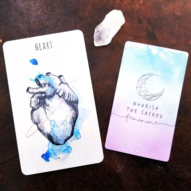
Heart

Heart from Scrying Ink by Siolo Thompson and Nourish the Sacred Feminine from Sacred Creators by Chris-Anne Donnelly | thiscrookedcrown.com


Other quick news for This Crooked Crown:

  • I recently changed up my newsletter to come out twice a month – once at the full moon and again at the new moon.The newsletters are smaller but contain mini divination readings for the current moon phase which is always fun.
  • Flying Salves arrived in the shop at the end of February and quickly sold out. I hope to have them in again by the end of May, if not sooner.
  • We reached out first goal over on Patreon. I’m always, always floored by the support I receive from everyone and cannot thank you all enough.
  • I received the absolutely amazing  Idiosyncradeck Tarot and the Amethyst Oracle from Jessica Bott who is probably better known as Cracked Amethyst. I’m absolutely in love with them both and can’t wait to do more readings with them.


Getting Back to Your Spiritual Roots by This Crooked Crown


So that’s what was up this month at This Crooked Crown. It was super busy in a way I wasn’t expecting but I’m thinking I’ve made the most of it. What were your favorite posts? What do you want to see more of? Planning on trying any of the spells? See you in April!


Review: Scrying Ink


Scrying Ink

Scrying Ink by Siolo Thompson © Bay & Willow

Status: Currently reading with it

Best for: Any style of readings, spiritual readings, personal readings

Favorite cards: Crown, Broom, Crossroads, Scissors

Acquired from and date: Siolo Thompson’s shop Bay & Willow. September 2016.


Heart
Heart from Scrying Ink by Siolo Thompson and Nourish the Sacred Feminine from Sacred Creators by Chris-Anne Donnelly

I’m a really big fan of Siolo Thompson’s work. I absolutely adore the Linestrider Tarot and watched this deck develop in absolute excitement. Scrying Ink is a Lenormand style deck which made me even more excited. This deck combines everything that I love about Lenormand decks with the beautiful art of Siolo Thompson.

Overall, the deck’s really solid as a Lenormand. It’s a 40 card deck not a 36 card deck – it has extra cards in it. Namely, an extra set of Male and Female cards plus the Crown and the Broom. The Scythe has been swapped for the Scissors. I’ll go into this in a bit but I’m always interested in decks that are slightly outside the cookie cutter norm so this was more of an incentive to me.

For me, the deck feels “cooler” energy-wise than the Linestrider Tarot does, perhaps less attached. I think that partially comes from the fact that the Linestrider Tarot was the artist’s first deck and this is their second. That first creation always has a ton of energy. That being said, the deck reads beautifully and has the feel and voice of a wise guide or mentor that lets you work out for yourself what you need to do rather than handing you answers.

You’ll have to know your Lenormand to use these cards appropriately. Or, you can use them as an oracle-style deck, but you’ll still need to have developed a fairly strong association game to really get to the cards. I find that despite there being very set meanings for this style of deck, it’s those very set meanings that sometimes requires additional intuitive insight to get to the bottom of the problem. Perhaps because of the additions and changes in this deck, I find that using your intuition can be helpful in getting to the truth of the matter.


If you’re familiar with the Linestrider Tarot, then expect the art of the Scrying Ink to be much of the same. Splashes of colored ink over black and white drawings on typically on streaked backgrounds.

The art is beautiful as usual and the color is used in brilliantly. There’s drips of inks here and there rather than coloring the whole card. For example, in the Broom, only the lacing is red. In the Crown, blue ink forms a secondary crown alongside the actual crown image – which is so brilliantly done because while a ruler might be free to do as they wish, they’re also imprisoned by their obligations and responsibilities to their country and people. The blue ink forms a secondary crown, yes, but it also forms bars over that crown, like a jail cell door.

The line art really reminds me of the art from classic fairy tale books I grew up, such as Grimm’s fairy tales. This seems to stand out more than it does with the Linestrider Tarot, perhaps because there are so few humanoid images in Lenormand decks. Lenormand cards are comprised of animals and objects mostly so it sometimes has only a handful of humans on the cards at all.

The type is clear, solid, all capitalization, and easy to read. That’s not something easily found in Lenormand style decks. I’ve a few Lenormand decks that have tiny type or just the numbers leaving you without that keyword to work with or requiring you to use the imagery or look up the number in a book.The cards are not numbered, however, so that’s something to keep in mind.

The backgrounds are something I’m kind of on the fence about. They’re typically a light gray or cream colored streaking that is different for each card. Ink is usually used to add color to the drawings such as with the Ship. But I don’t know. Maybe it’s because the streaking is hard to photograph or maybe because it’s sometimes distracting but there are some cards where the background stands out more than others when I don’t think it should. That being said the backgrounds also help tie it together. This might be a weird thing to nit-pick but it’s one of the very few things I’m sometimes not thrilled about with this deck.

Another weird thing for me is the card backs. It’s a black and gray design that reminds me of tattoo ink at first then fairy tales second. It’s also somewhat “hazy” and on close inspection, you can see how it’s printed on the card. I wouldn’t look at the back of those cards and be able to guess what the Scrying Ink is actually like from it.The card backs are also not reversible which isn’t a big deal at all as Lenormand style readings aren’t meant to be read in reverse anyway.


I like the Crown addition (of course I do) but I especially like it because it fills in that space that handles where our responsibilities lie. The Crown might appear if we’re taking on too much responsibility or if you need to own up to your own responsibilities. It’s like the Tower card in this sense but with less emphasis on isolation or the unattainable.

The Broom and Whip have been separated. If you’re familiar with Lenormand decks this the Whip (11) can be confusing. I typically like to think of the Whip more like the Whisk – it can stir things up but it can smooth things out too. I think the Whip’s original meaning has a lot of historical implication lost to us. Remember the Lenormand came about in the 1800s or so. The whip would have been used to imply punishment or hurrying – you whip a servant for theft, possibly child for disobedience, and a horse to hurry. This kind of thinking wouldn’t have been unusual at all at the time so we have to remember that. Since we do not allow such things anymore, most people don’t really think of the whip much anymore. Save for Indiana Jones and “whipping yourself into shape”, whips aren’t commonly thought of. We’ve lost touch and meaning to the original intent of the card. It became more of a whisk or even a broom. This still has historical merit and meaning. the Whip is known for aggression, disagreements, discipline, and violence. It’s the card of physical activity. On a more modern scale, it comes up when you’ve had a disagreement with your spouse or parents and it something of the “oh shit” card in my book when it comes to household stuff. It’s the text message saying you’ll be receiving surprise visitors in fifteen minutes and you have a sink full of dishes and laundry scattered across the house. It’s annoyance and anger. It’s abuse and it’s harsh reality.

The Broom and Whip helps separate out some meanings. Now the Whip stands more of what it was originally intended for. The Broom is used for clearing away what happens after the Whip – the hurt, the dust from physical activity, etc. The Broom is a healthy separation whereas the Whip could mean a nasty break up. The Broom is compromise or a fresh start. It’s cleaning house. It’s also work so that physical aspect isn’t missing from the Broom either. The Broom also helps bridge the gap when it comes to swapping the Scythe for the Scissors.

The Scythe for the Scissors was an interesting change and one I wasn’t particular fond of when I first got the deck. Now I love the change. I personally associate really well with your standard Scythe card. The Scythe is the cutting of ties but it’s also reaping what you sown. It requires rapid action. The Scissors encapsulates all this meaning is a more understandable fashion for modern readers. I find that the Scissors associates well with the Broom because that clearing away the unwanted idea. The Broom now covers that aspect of the Scythe card, allowing for clearer and cleaner readings.

The Male and Female cards are some of my least favorite cards in any Lenormand deck. I’m not fond of the binary system (though I get it and it’s easily worked around in any Lenormand deck) so I tend to just use the Male/Female cards as “self” or referring to a particular individual when it comes up in an oracle-style reading for me. In this deck, there’s your typical humanoid Man/Woman card (Lord and Lady) but there’s also Female and Male. These two cards associate directly with the Child card. How? They’re deer. The Female card is a doe, the Male card is an antler, and the Child card is a fawn. I adore this. I read this as a subtle difference between Man and Male. The Man card might refer to a co-worker whereas the Male card suggests a masculine energy instead – that could be your female non-nonsense boss. The difference is subtle but extremely useful for my readings. It allows for people to be able to subscribe to a card more easily. If you’re non-binary, you might select any of these card depending on your mood at the time. I’m still searching for a deck that offers a more options in terms of sex and gender but this is a good alternative to the Man/Woman style cards.

Overall, the cards given an impression of a wise mentor, as stated above. The energy isn’t as mischievous as the Linestrider Tarot can get but isn’t afraid to throw down as needed. I find this deck tells you exactly what you need to know but sometimes leaves you to draw conclusions and the details of the situation. For this reason, I find myself using this for answers and personal readings. I don’t just mean my own readings for myself but the readings that dive into my own mentality and spirituality. It’s rare for me to have a deck like this so it’s really very perfect in my opinion.


The deck itself is large. It’s not as big as Blue Angel Publishing decks are but larger than my smartphone in width and as tall as a it in height. While at first I was surprised at the deck as they’re still a bit large for my hands, they’re a good in between size for a large deck so it’s still fairly easy to shuffle. According to the website’s information, the deck measured 5.75 by 3.5 inches.

The deck’s matte but has a slight sheen to it when you turn the cards in the light. To me, that’s the perfect sheen for a deck. I want to be able to take photos without messing with a thousand camera settings and lighting to get it.

The card stock is thinner than I expected but that’s not a bad thing. Because of the size, the flexibility the thinner card stock has allows for it to shuffle easily. This immediately solves the “my deck is too big to shuffle issue” because while the deck is on the large size, the flexibility of the cards means that it can be shuffled or even bridged without worrying about the cards bending. The cards are smooth with a noted rounded edge which I like.

That being said, I’ve noticed minor almost invisible scratches from finger nails and some wear on the card sides from overhand shuffling. I typically have short to medium length nails so I’m not surprised about the scratches. I’m not gentle with my overhand shuffling so the wear isn’t surprising either. All decks develop these sorts of things so I’m not sure why I notice it more in this deck. If you’re gentle with your cards and not a brutish monster like I am, you’ll probably be fine. (Seriously though, I really am not gentle with my cards so you’ll be fine. The cards are high-quality.)

My Linestrider Tarot is the Kickstarter version and it arcs. This means is does not lie flat when placed on a flat surface. This is probably due to my riffle style shuffling technique but my only issue with that version of Linestrider Tarot so I worried about it with the Scrying Ink. I needn’t have bothered. The Scrying Ink lies perfectly flat and I have no worries about arcing.

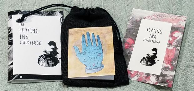
The deck is nicely packaged. It came in a plain cardboard but labeled box with a note card, a card introducing the Scrying Ink, briefing sheet about the Houses of the Grand Tableau, a black burlap bag, the guidebook, and the deck. It’s almost too much stuff. The box is large and strong enough to be keep around but it’s not a tuck box. I kept the sheets and stuff the deck came with in the box on the shelf separate from the bag, book, and cards.


Scrying Ink


When I fist opened the box, I was surprised at the burlap bag. It’s not super soft so it’s not really a material you’d expect a card bag to be made out of. Plus it’s a good size larger than the deck – four inches taller and about an inch wider. It made sense though once I saw the guidebook. The guidebook fits perfectly inside the bag. However, putting the book inside the bag means that the bag doesn’t close but it does cinch at the top. I haven’t had traveled with the deck yet so I don’t if it’ll survive being tossed in a suitcase or backpack but for storage in my home it’s good enough for me.

The guidebook included is your typical soft-covered stable based book with 53 pages. It’s nothing fancy in that regard. It has a little about section with a how-to in reading the cards. It includes an explanation of a three card spread, a nine card spread layout, and a breakdown of the Grand Tableau. Then it jumps into the card meanings.

The card meanings are number appropriately to Lenormand style. The Rider is number 01 and the Whip is number 11 and the Cross is number 36 and so on. Additional cards are at the back of the book.

Each card description comes with keywords, a general description, and playing card cartomancy equivalent. It also includes what to look for in particular readings and suggestion combinations of cards in these particular readings. (Dog + Man in a career reading could be a loyal business partner, co-worker, or boss whereas in a romance reading it probably means that your partner is loyal). This is all fairly standard when it comes to Lenormand guidebooks and each card takes up about a page in length of the guidebook, give or take. In the four additional cards, a little description on why those cards came to be is offered in place of the breakdown for particular readings.

It’s a good book for an small indie creator as it’s doing exactly what it’s suppose to. it might not be perfect bound or super fancy but it’s far more useful than a LWB.

It’s good to note that the first printing was limited to 250 copies and hasn’t been restocked. I don’t know if it will ever be restocked. A mini version of this deck (2.48 inches by 3.46 inches) available now with a different card back on Bay & Willow. While I don’t own this one, it’s on my list to pick up largely due to the size (I love pocket sized decks). I don’t know if it’s limited edition so snatch it up while you can.

Overall, I adore this deck. I like the changes within the deck quite a bite and my worries about the quality due to the Kickstarter version of Linestrider Tarot are alleviated. It’s a beautiful Lenormand deck that fits right in with more traditional decks while still being modern and approachable for everyone.

If you’re going to read this deck like an oracle and not Lenormand style, then it’s very beginner friendly. If you’re looking at this deck and hoping to learn the Lenormand style of reading, then you may want to learn with a different deck. The changes made in this deck will throw you if you’re not use to the cards or not reading intuitive.

It’s definitely a deck I recommend – if you can get it. It’s a lovely deck and one I wholly appreciate. I find myself pulling it out often to help with everyday questions or even help with journaling or writing.


Scrying Ink by Siolo Thompson © Bay & Willow

Rider and Nourish Your Sacred Feminine cards in the images from the Sacred Creators by Chris-Anne Donnelly

Review: Bleu Cat Tarot


bleu-cat-tarot-05-this-crooked-crown

Bleu Cat Tarot by Beth Seilonen and Schiffer Publishing 

Status:  Currently reading with it

Best for: Everyday questions but especially those with a fun or not-so-serious edge to them. Great for cat lovers or fans of the Siamese cat breed.

Favorite cards: Magician, Sun, Tower

Acquired from and date: Bought myself in early February 2014 from Amazon


My adoration for cats has been life-long and well-known. Early 2014 rolled around and I realized I didn’t own a cat related deck at all. Which was weird because there’s a great many cat-centric decks out there! My problem was that I’m kind of specific on the kind of decks I want to own so many of the more popular ones weren’t super interesting to me.

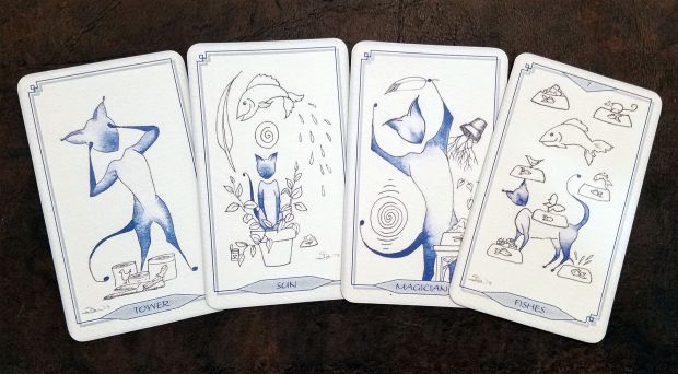
Then I found this one. The Bleu Cat Tarot is minimalist, and simple at it’s core. Artfully done images of Siamese cats are done in indigo but keep the playful yet dignified attitude of cats. And it has Siamese! My favorite breed of cats.

This isn’t just a novelty deck to catch the small niche of Siamese lovers. It reads extremely well as it’s a RWS clone. It’s definitely one of those deck you’ll either love or feel “meh” about.

Super quick note: The blue of the ink and the black ink lines are darker and more pronounced in the deck than in the instagram pictures. The other photos have shadows because I wanted to stay true to the coloring of the ink. Simply put: The cards are white, not beige.


bleu-cat-tarot-04-this-crooked-crown


The Bleu Cat Tarot is a four tone deck. It has vibrant purple-blue denim indigo with a lighter gray-blue that matches the border and background flecks. (The depth of the blue color doesn’t show well in my photos due to lighting.) Then there’s the white of the card and the black ink of background imagery. The card images themselves look something like parchment paper, not entirely smooth despite the card itself being smooth. This is likely intention and comes from the type of paper the art was originally hand-drawn on.

The artwork is stylized and you’ll know just from glancing at these accompanying images or even the box art whether this is for you. There’s no sneaky surprises when it comes to the art. It’s entirely consistent.

The life within the art speaks to anyone who has ever owned a cat. The Death card? A dying plant and the cat standing on a cat carrier (prepping for a trip to the veterinarian, according to the included book). But there are still esoteric images like the High Priestess or Hermit.

The court cards (page, knight, queen, and king) add a little humanity but donning on appropriate hats, helms, and crowns. So you have a page with a plumed hat and a stack of books or a knight with a sword and feathered helm. It’s nothing so out of sorts with the rest of the art. In fact, some tolerant cats might even deal with the costumes in the courts fairly well in real life.

The writing has a slight “Asian” feel to it, reminding me a tiny bit of Chinese restaurant menus in a good way. It’s all in capital letters, blue on gray background. The Major Arcana aren’t numbered but the minor is, save for the Ace, which is spelled out. Since the text is computerized, like the borders, it’s uniform and therefore isn’t hard to read.

The borders are small and suit the deck. At first I wasn’t fond of them but they grew on me. Not all of the border is computerized. The diamond at the bottom of the cards and the triangle at the top of some of the cards are part of the original artwork. The borders and text were added later on the computer. Unlike a lot of decks with borders, this border doesn’t take away from the art. It kind of feels a bit weird though. At first I didn’t like the borders but not I’m rather apathetic to it. The borders exist and they’re small enough where it’s not worth the effort to attempt to trim them.


The deck is a Rider-Waite-Smith clone but switches out the swords, wands, cups, pentacles for feathers, plants, fishes, and balls, respectively. It goes along with the cat theme beautifully. But with all thematic swapping of suits, it takes some getting use to.

The other thing is that this deck can be kind of tricky if you’re not overly familiar with the components of a RWS deck. The deck doesn’t contain many details so if you don’t have a firm grasp of the RWS tradition, you might find yourself stuck trying to figure out what the card might mean just from the image. Intuitive readers might have an easier time with this deck, if they can get into it. If not, then it probably won’t click much at all.

You also have to channel your inner cat mentality. For example, the 7 of Fishes (Seven of Cups) had a bunch of food bowls in it, floating around. Which matches the traditional imagery of the Seven of Cups well but also matches a cat’s mentality. What kind of fantasy does your cat have? Probably something related to food, I’d gather.

I’ve also used this deck with great success for answering questions about being deceived, pride /ego, procrastination, and laziness.It’s also extremely good at spell related questions, especially glamours and illusions. It’s also unusually good at spirit related cards and handles faery related questions without having to deal with the faery decks’ run-around behavior.

This deck does sometimes throw you the odd “well, what did you expect?” sort of answer. All readers get the “how do I overcome this thing?” where the deck answers “by overcoming it”. Super helpful. This deck does that too but it adds a slightly sly or even cutting response. Exactly like a cat would, really. I guess if you want straightforward answers, you’d need a dog themed deck. Ever meet someone who is super intelligent but perpetually done with people and just sits back, making snarky comments? That’s this deck.When it wants to sass you, expect ALL the sass.

That being said, generally speaking the deck answers the questions in a helpful manner. It’s pretty good at giving you a different perspective. I also think it helps calm down things when you’re feeling panicky. That’s probably more the color palette than anything else but sometimes I feel like the deck is saying, “hey, chill out”.

Since the cards only have four colors throughout it, the cards could come off as “boring”. It photographs well but it’s not a deck I break out for client readings often unless it feels appropriate in some way. It’s definitely not a festival or faire kind of deck. It could be a really good deck for trying to read your animal’s inner thoughts and mood but I usually stick to using it for everyday questions for myself.


bleu-cat-tarot-2


When it comes to the practical stuff, the deck really shines. It’s a matte finish deck with thick card stock. It’s easily double in thickness of some of my “thin” card stock decks like Fairy Lights. While the thickness adds height to the deck itself, the cards shuffle easily. The card size itself is a not quite standard size for tarot decks. They’re in the ballpark of 3.5 inches by 2.5 inches. Around the size of a pocket memo book and a little shorter (but not wider) than my phone when in a case. I’d consider them a great size for cards but the thickness can make shuffling a bit less automated than a playing card deck.

The box it comes in is a keeper. A magnetic closing, thick cardboard box with white ribbon to keep the lid from flipping open entirely and cracking the hinge. The cards come right to the top of the box so you’ll need to place the included book on top of the deck so you don’t loose any cards. The lid does stay closed but if you’re aggressively tossing the box around, expect it to fly open. It’s only held closed by a magnetic. That being said, I haven’t felt that I’m at risk of losing my cards or damaging them if I keep them in my handbag or a small pocket of a backpack. I might add a rubber band to the box if I had the box in a tote-style of bag where it’s tossed in with everything else. I’m paranoid though so YMMV. I believe the deck was shipping in this box with plastic wrap over it, just as a heads up. It didn’t come with any additional packaging outside of this.

The included book is the same size as the deck itself. I find that the printing is a bit too close to the binding so you have to open the book widely in order to really read the card descriptions. The book doesn’t offer reversal meanings but does have a blurb around reversals. Pretty much, the meaning might slightly change but otherwise, read however you want.

Do at least skim the book. There’s little tidbits in there than can help determine meaning of certain cards or at least explain why they’re not exact clones of RWS. Also, the deck was created around Seilonen’s own Siamese cat’s antics so that comes through clearly with the book descriptions and introduction. The deck is meant to make cat owners smile at the kitty antics – and it does it’s job beautifully.

There’s two included spreads in the deck. They’re written for this deck so they fit the theme and are solid. Both are four cards each, one for situations and another for introspection.


bleu-cat-tarot-06-this-crooked-crown


The Bleu Cat Tarot is a cat tarot deck but it’s a cat tarot deck for cat owners who want to smile at the ridiculous kitty antics their own cats have pulled off. It’s not just for Siamese lovers – anyone can appreciate the cards, but the specific breed will pull in anyone who enjoys Siamese.

The art is stylized so if it’s not your style, you’ll want to give this a miss unless you’re a serious collector. It’s also not super beginner friendly as doesn’t have a ton of details to parcel out the meaning from. That being said, as a RWS deck, if you have a fairly good grasp of the cards, you should be able to read this deck easily.

While this deck isn’t vibrantly colorful or full of details, it’s full of fun and life. It’s definitely a deck that you either aren’t interested in or it’s totally your thing. It’s different while still being a RWS. As a Siamese and cat lover and someone who likes unique tarot decks, it was a must-have for me.


The Bleu Cat Tarot by Beth Seilonen © Schiffer Publishing


Finding My Soul Journey

It’s really hard to just go against the grain. I constantly hear people say how hard it is. I’m not really one to speak. I have created my entire lifestyle so I don’t have to deal with that kind of difficulty. I live in my own little world and don’t much care for what others think or say. I worked very hard and sacrificed a great deal to get that kind of mentality and lifestyle.

Most people can’t or won’t do that. That isn’t a rebuke or insult. Some people can’t for practical reasons – they have family, can’t afford it, or survive within a group dynamic. Others won’t because it’s not how they want to live.

I love my lifestyle. But I’ll be the first to admit that it’s very solitary and can be very hard. And I really respect people who don’t want to live this way or cannot. You’re following your priorities. I have the luxury of being in a position where I can sacrifice things I kind of want for what I really want: freedom. It’s as essential to me as writing or witchcraft so I chase after it. I chucked away chains that tied me down – acquaintances I didn’t want to deal with just out of politeness, jobs I was unhappy with, relationships that weren’t meaningful to me, and more.

Getting to the point where I recognized that freedom was an essential need for me was a soul journey all of its own. Each person who goes through these journeys and epiphanies will have different stories to tell.

I can’t tell you how to find the catalysts to these journeys. I can’t even really tell you how I got to my own revelation. It just sort of happened. Shadow work helps, certainly, by sweeping clear the rubbish and bringing the light into forgotten places in your mind and soul. Bucking doubt and just going with the flow of things also helps. I stopped questioning myself and just did what felt best for me.

A lot of times, people embark on these journeys after a drastic change or trauma. Others, like myself, have a snowball effect all leading them to the same place. You really can wake up one day and decide to change.

Change isn’t easy. I like change. I’m a Gemini so change is second nature to me. But I don’t like change that I don’t feel in control of. It took a long time for me to recognize that giving up control is controlling the situation. I let things happen as they happened, organically, and just dealt with things as they come. I’m much happier for it. In fact, it reduced my stress level so much I was able to go off medication for chronic acid reflux. Now I can medication only when I’m stressed or eating foods my body doesn’t like. It allowed me to grieve for my late mentor and the loss of a spiritual path I no longer felt welcome in. My soul journey was healing, both physically and spiritually.

2014-12-04 17.11.57

My favorite way to use bells is to wear them!

Embarking on this soul journey won’t instantly fix your life and won’t instantly cause you to be more spiritual. It should bring a deeper understanding of yourself into focus. And from that new understanding, you can begin to alter and build you life to better suit the needs of your soul.


Divination Tool Review: Halloween Oracle

Halloween Oracle by Stacey Demarco & Blue Angel Publishing

Status: Currently reading with it

Best for: Halloween and autumn but it offers the truth in an interesting and unique way. Great for all questions all year around.

Favorite cards: The Veil, Invisibility, Scrying

05

I’ll admit it: I love Halloween and when I saw this Halloween Oracle it shot up on my “must have” list to #1. No regrets at all.

It’s a beautifully vivid deck with some quirks that gets you into the Halloween mood nicely. It’s also great to use during the autumn season because of the more autumnal feel to the cards. That being said, I use this deck all year around in my personal readings, especially when I’m doing readings to spark creative writing. It just has that kind of fun but serious feel to it.


I’ll be honest, this Halloween Oracle is a bit strange. There are some cards that don’t read as Halloween at all to me. I think some of that comes from the artist being Australian rather than American. It doesn’t have the same kind of American Halloween kind of feel. That’s not a bad thing but it’s something to keep in mind.

The deck also feels somewhat disconnected. The skull set, for example, is lovely but I think they might have been better served as a separate oracle all by themselves. The Lady De Los Muertos is kind of a surprise as it’s the only truly culturally specific addition to the deck and I’m not sure it’s appropriate given the rest of the cards. I think it would have been more appropriate in an entirely Mexican deck or a deck with traditions from all over the world.

And then there’s cards that don’t wholly seem to fit the Halloween them at all. Like Forgiveness and Hearth. I can see the connect, especially if you think of the rituals performed around the holiday. I don’t look at the Hearth card and go “Halloween!” It’s something of a logical leap.

There is a definite witchy feel to most, if not all, of the cards which balances out the deck for me, personally. A less witchcraft-oriented reader might not get that same feel.

Weirdly, the back of the deck has a very Halloween less serious feel which kind of seems like the artist was phoning it in for the deck backs.  It doesn’t really mesh well with the deck’s painted sketch style. If you saw the deck backs without knowing what the cards were suppose to look like, you’d probably be surprised.


The art, as you can see, has a almost painted sketch quality to it. They’re not sketches, exactly but they’re not fully cleaned up art either – and that’s the point. The art is finished but it has a washed or scraped feeling to the art. It’s kind of like someone drew it then scraped a broom over the surface of the art. The images are clear but there’s a lot of background noise.

Speaking of backgrounds, outside of a few select images like The Lamp, there isn’t a lot of background to the image. There’s a lot of the scraped colored and light filter kind of backgrounds. Which I kind of like as it focuses the main image more. It doesn’t lend any additional meanings, really, but rather serves as an assistant to the mood of the card.

The art varying somewhat in another unique way. There’s the natural styling like in The Lamp or Nightsong where it’s clearly a complete picture. And then there’s singular focuses where there’s nothing but the card’s focus seen, such as with The Pumpkin or Invisibility. And other times there’s this surreal thing happening. The Underworld, Midnight, or Ghost shows off what I mean where there’s kind of a main image and some hue background and some other elements going on all together. The Apple, Joy, and Black Cat show this a bit too. It’s like a scene but without the coherency of the scene – and yet it’s still coherent as an image. Almost like a collage except it’s all one image. It strikes me as odd and I’m not sure if that’s just me not fully liking that as a style choice or something else.

The borders are black with a color second border around the image.  The color is the most prevalent color in the image but that sometimes means the border stands out a lot and other times it melts into the image. I think I’d like to see this borderless or without the second border at least. If you’re into trimming cards, this is a definite candidate. Especially since when trimmed these cards would be so much easier to handle.

I know from looking about the internet that the art style in general is the same for all of the artist’s cards but I’m not sure about the backgrounds. That might be unique to this deck. The large and secondary border thing is definitely a Blue Angel Publishing trait as my Sacred Rebels Oracle has a similar style.


Personally, I tend to use this deck for when I need a push in the right direction without any sass. I also use it for daily draws a lot. One of my favorite usages is to pull a card to help build original characters for writing (oh hai NaNoWriMo participants!)

I sometimes find myself pulling the deck apart and putting the decks into groups and then fanning that particular group to get a reading. For example, I might pull all of the skulls and pull a card from that. I don’t really do that with other decks so I’m thinking it’s because this one’s kind of disjointed. But I also do it because it’s easier to pull out cards that are useful to character creation.

That being said, I totally do use this for your regular ol’ readings. It’s not great for large readings as it only has 36 cards but unlike the Lenormand or Tarot, it’s sometimes hard to pull a full and complete story or reading from it. Or, rather, you could create a whole story from all the cards but it would take some clever talking to cover yourself. Might be a fun experiment.

I don’t find that this deck specializes in any particular way. It covers all the questions equally but does slightly better with personal questions. For example, I’d probably pick another deck for a financial based reading but if this one was within reach, it would handle the question well enough. It’s not designed to cover a lot of the more practical questions but it can still handle them.

All of this being said, there’s not an overwhelming spirit to this deck for me. I get a sense of purpose and of mischievousness and just the right amount of shadowy darkness to really mark it as Halloween but not a spirit that jumps out and says “hi!”. This is n’t even remotely as  vocal as the Heart of the Faerie Oracle, for example. I consider the Heart of the Faerie Oracle an extremely vocal and personality driven deck. This one’s more low-key in personality.


hocollage


That being said, the deck reads extremely well despite the size. Blue Angel cards tend to be larger in size and this one is no exception. The size makes it rather hard to shuffle. Those folks with smaller hands (like me!) will find themselves struggling to shuffle these cards. My tip? Rotate the cards so you’re shuffling not on the side but on the top. If that doesn’t work, try the fan method or a stacking method.

The deck box and book are all nice and study. The book isn’t your average LWB. It’s 73 pages and nicely written with the meanings. It also has the images of the cards alongside the meanings. It’s set up in alphabetical order which is good because the cards aren’t numbered. Some oracle decks don’t have that and it’s frustrating.

The cards are solid. They bend nicely like cards should but can take damage. I’ve even spilled coffee on the cards and just wiped it clean (in a panic, because liquid + paper = enemies). The cards have a plastic (?) coating to them which means they can take the aforementioned damaged. But it comes with a cost – they’re highly reflective. Like “I can send signals and see myself” reflective. Their shininess makes photography a challenge, especially with strong light. It even reflects in candlelight!

Even worse, the shininess makes all sorts of damage appear obvious on the card. Bent corners, scratches, and even dust are very noticeable. Even fingerprint smudges. This isn’t a problem if you photograph in low light or use filters to correct the problem but on-the-go photography can be a challenge. It also doesn’t really show on the face of the card when you’re doing a reading unless a serious scratch. It shows more on the back of the cards.


While I seem to bash the deck a lot in this reading, I actually really love the deck. It had a lot of witchyness to it which means I can use it all year around. I always have fun reading with it. I find the written meanings are just vague enough to allow a greater range of usage.

I really like this deck, I do. I’m not sure I’d love it more if some of the above things were different. I wouldn’t love it less either. It’s one of those decks I love despite what I see as flaws.


Would I recommend it? Yes. Would I consider this the ultimate Halloween divination deck? No. There’s just enough quirks against this deck to have me continue my search for the best Halloween deck in the land. But I do love this deck!


Halloween Oracle by Stacey Demarco © Blue Angel Publishing

Divination Tool Review: Fairy Lights Tarot

Fairy Lights Tarot by Lucia Mattioli. Published by Lo Scarabeo

Status: Currently reading with it

Best for: Spirit readings, astral or spiritual related readings, faerie readings, complicated social matters, daily draws, getting in touch with your intuition, and story-telling

Favorite cards: Six of Chalices, Eight of Wands, Five of Pentacles

Acquired from and date: Part of a barter with Kara Driscoll in March 2016

Fairy Lights was one of those decks I found absolutely beautiful so I put it on my Crown’s Witchy Wishlist. It sat there for a couple of years while I focused on getting some other great decks in my collection. Then it was gifted to me as part of a barter. I’m not wholly sure what I expected but Fairy Lights both did and didn’t meet my expectations.

I knew the art was soft and beautiful. It’s definitely a fairy deck both in feel and in depth. But for some reason, I didn’t get the same kind of instant pull towards the deck as I did with the other two decks I was given. In fact, out of the three, this one took the longest for me to want to work with. Which is an absolute shame because it photographs beautifully.

And that’s the thing. This deck IS beautiful and I found little to complain about. But it does require some work to get into the feel of it. I don’t deal much with faery courts in my practice but this definitely reminds me of a faery court – in a good way. Each card has a lot of personality so when you’re working with this deck, make sure to study each card closely in order to fully appreciate the deck.

This is an extremely beautiful and intricate deck. The art is very moody, very colorful, and very fluid. It reminds me strongly of some of the art that accompanied the fairy tales I read as a child. The art is soft and diffused. The gray borders might seem like a strange choice but I rather like it. I think it makes the image of the cards stand out, like a window into each little realm the card shows.

This is not a deck that’s all light and goodness, however. This takes a lot of inspiration from fairy-related stories so you’ll be able to recognize the stories within the images. Some I didn’t recognize the stories to, such as Two of Wands, so it might just be a fantastical image or I don’t know the story.

The colors are extremely bright and vivid, as you can see with the variety of photos but there’s a lot of dark images too. Lots of vibrant colors. Really, this is kind of the perfect blogger deck color-wise because there’s so much color and the palettes are really good.

Nudity is also commonplace but when nudity does appear, it fits the image. Justice, for example.There isn’t a huge amount of nudity but it does exist. I wouldn’t consider this a kid-friendly deck. The nudity here is chosen well. It means something rather than just being a part of the art style.

Content-wise, the deck doesn’t have anything that shocks you out of the deck.There isn’t a sudden modern image surrounded by medieval image. The Emperor was the only one that kind of threw me – it shows a conquistador and army at first glance but the more I looked at it the more I realized it could easily just be an explorer and army.

What I really liked is, except for the numbers, there’s zero script on the deck. The suits are separated by a physically shown sword, cup, wand, or coin. For the Court Cards, for example, there’s just a helm, horse, or crown to designate status. The Major Arcana has just the numbers.

But that’s also a challenge. While the symbols for the Court Cards make searching for those cards in the deck easy peasy, it also means that you have to recognize those symbols for those cards.

Same thing with the suits themselves. They’re fairly self-explanatory when you’re looking at the four suits together but sometimes I forget the sword is represented by an actually swords and not the wand. It’s a silly mistake on my part but it’s one with noting.

The deck back is absolutely beautiful. It fits in very well with the deck and makes this a great deck for adult festivals and events because it’s interesting no matter what side is being shown. The image isn’t a mirror reverse, however, so you will be able to tell the subtle difference between a reversed card and a right side up card.

Not that I think reverses matter with this deck. I’m hit or miss on whether I read a deck with reverses but this one I wouldn’t. Or, rather, I wouldn’t for most readings. I think it would be extremely situational. There may be some merit to remembering that this is a view of a faery court which is othered, separate, somewhere else. Upside down is a common indication of this realm. So, if you read with reverses, you might want to keep that idea in mind.

I think this deck could have really benefited from a companion book. The LWB included in the deck is fairly useless. I’m usually one to give the LWB a chance but this one is a fairly standard LWB so it’s kind of a waste. The box is your standard tuck box so it’s nothing exciting in that terms.

This deck isn’t one I’d overly recommend to beginners. If you love the art and are willing to learn, go for it. But the lack of words and the lack of recognizable imagery can make it a tough deck to learn with. If you’re familiar with RWS style decks, you’ll definitely pick up on the placement and shared imagery that occurs with RWS decks but otherwise, it doesn’t stand out.

When it comes to deck size and shape, the deck is narrow in width. I think some of this is a trick of the eye due to the borders but the  cards are actually 2 1/2 inches in width. The deck is almost half an inch more narrow than my Dreaming Ways Tarot. In fact, my Classic Tarot, which fits inside a cloth eyeglass sleeve, is probably the same size as this deck. Height-wise, they’re about average. This is definitely one of those decks I would have preferred larger cards though. The art is so intricate and lovely that a larger size would be good to really soak in the details without straining your eyes.

The paper stock is a bit thin. It makes the deck very easy to shuffle but the thinness has me concerned for the deck’s lifespan. Actually, the deck shuffles extremely well. Actually, I found the card somewhat slippery right out of the box. I want my cards to slid easily but not slip out of my hands when just moving the deck about.

I really like this deck. The more I use it, the more I like it. It’s not as playful as my other faery decks but I feel like it makes up for it with the lack of humans. The faeries aren’t just humans without wings. Some aren’t even humanoid and I love that. I’m a big fan of representing things as they appear in the spirit realms and this definitely has that feel to it.

Overall, would I get this again? Yes. It’s a great deck and has a lot of heart the more you look at it.


Fairy Lights Tarot by Lucia Mattioli © Lo Scarabeo

Divination Tool Review: The Heart of the Faerie Oracle

The Heart of the Faerie Oracle by Brian and Wendy Froud with Robert Gould © Harry N. Abrams

Status: Currently reading with it

Best for: Everyday questions, as this deck loves attention but relationship and spirit-relation questions are favored.

Favorite decks: The Rox, The Fixer, The Dreaming

Acquired from: A gift from a follower on tumblr back in 2012.

01

A gift from a follower who has since left the community. This is one of my favorite decks and certainly one of the easiest to work with. This deck can be snarky, a bit dark, and have more depth and meaning than you might assume right off the bat.

While this deck was designed for relationships (not just romantic but in general) and for introspection but there’s very little that this deck won’t do for me. This deck can be mischievous, blatantly and sometimes painfully obvious, and have hidden depths that can be easily missed by other readers. If you love faeries, this is the deck to chose, no matter what your question is.

It should be noted that this is an oracle deck, not a tarot and does not follow the tarot meanings in any way. Each card has its own meaning that as been written by the deck’s creators Brian and Wendy Froud. That being said, as with all divination tools, it’s up to the reader to divine the proper answer from the cards.

The book’s published by Abrams publishing so I’m assuming the deck is published there as well or outsourced accordingly. The printing quality is very good although the card stock is a bit on the thin side. Not paper thin but slightly thinner than your average tarot card or playing card.

The card stock still retains a sheen, even after years of abuse, although the sheen isn’t shiny but rather matte. This means that light doesn’t reflect off the cards but you will get a glare on the cards. It’s the same kind of coating playing cards use I believe. Due to the sheen, you’ll be able to tell under close inspection there’s scratches on the card but unless it’s a deep gouge, the card image itself probably won’t be damaged.

The cards are somewhat larger than average tarot cards, making the cards occasionally difficult to shuffle for those with small hands. The rounded edges are slightly more round than a normal tarot card I’d say, more along the lines of a playing card.

For some reason, this deck doesn’t really shuffle super well. Because of the size, I can bend the cards to shuffle the riffle-style but they tend to clump together in chunks, even after years. I’m assuming this is due to the size and card stock coating. I remember it having been difficult to shuffle when I first got the deck. Fanning powder wouldn’t go amiss here or just shuffling often to keep the cards moving smoothly.

The cards hold up well over time. I’ve used this deck on an almost weekly basis for years and only the edges where I shuffle are a little worn. It even holds up well in travel which is good because it’s gone across the country and around town in a handbag dozens of times.

The deck came in a large, flimsy cardboard box, not unlike a cracker box. I abhors tiny items in large boxes for seemingly no good reason, largely because with smart packaging design, it would save so much shipping cost and waste. In this case, the box size was largely created due to the companion book size.

I tend to keep the boxes because I have the space but I don’t store it with the book or deck. It’s stuck under a shelf actually. Instead, the book sits on a bookshelf with other divination books and the cards in a bag I crocheted for it.

This deck does come with a lengthy, hard-covered companion book (as does Brian Froud’s other oracle deck, the Faerie Oracle). There’s a ballpark of 137 pages (including the “notes” section). The book is broken up into sections such as “Queens”, “Queens’ Consorts”, “Archetypes”, “Tricksters”, and “The Journey” among others. Each card has it’s own page or two, with a red-toned image of the card in question and since easy card is numbered, it’s easy to look up the card’s meaning in the book. The cards are give a few key meanings (usually three) and a paragraph or two of some more in-depth things to look for. Since the deck is geared towards relationships and personal introspection, the questions or musings will pertain mostly to that. If you’ve read Froud’s work before, you’ll recognize how the faeries are described, not as images on a page but living people that are speaking to you through the artwork.

Little drawings from Froud are scattered throughout the book making it a pleasure for even just Froud fans to flip through. Additionally, there’s a few pages in the back for notes (as well as ample space in the pages’ margins). There’s also a little introduction in the beginning as well as a oracle how-to and interview session in the back with Frouds about the deck. There’s also a few scattered mystical quotes throughout. One spread is described in the back of the book but it’s entirely words so visual-oriented people might be displeased.

Overall, the book’s pretty handy and almost necessary at first but you’ll find yourself using it less and less over the years. I tend to only glance at it when my brain blanks out or I know there’s a keyword that I want for a specific reading and can’t remember it.

02

Art-wise, it’s Froud so expect some uniquely Froud designs. The large borders around the cards sort of disappear after a while because the colors of the borders at least go with the theme of the deck. It would be pretty hard to cut down the borders on this deck due to the typography and images.

The deck backs are colorful and remind me a bit of Sailor Moon. They’re very pretty and go along with the general theme of the deck. They’re also consistent mirrors so you can’t immediately tell if something’s reversed unless the card’s damaged in some way.

The art’s consistent in the sense it all has the same theme and it’s all very Froud. However, some cards are super fantasy-vibrant and others are dulled or almost folk-like. There’s a few cards that come off as sketches such as Oh No! and Of Two Minds This is all very on purpose however rather than feeling unfinished.

Color-wise, you get a pretty wide variance. Some cards like the Queen of the Night are dark while Oh No! and Of Two Minds have a greyscale sketch art. Elaborate backgrounds are everywhere here so there’s always some detail to look at in the cards. Some cards will strongly remind one of the Faerie Oracle such as The Faerie of Naughtiness or the Star Faerie in the sense that it’s more light and swirls than clear cut images. Expect a lot of dark purples, browns, blues, and black with splashes of lavender, white, gray, tan, and red.

03

The lettering is capital print in white and stands out nicely with the cards, making it easy to read. Usually you’re looking at the images. Sometimes the lettering can be difficult if there’s a super busy background in the card because the background can be distracting more than the lettering is difficult to read.

Nudity is pretty common in the deck and while genitals aren’t showcased, buttocks and breasts are fairly prominent. It reads entirely as art though and not pornography. It is something to be aware of when reading for others.

04

The content of the cards are very consistent as well. You know you’re looking at faeries. Some have more presence than others. Hope reads not as a subject where the faerie is key but the situation the faerie is in. In the Question or The Leaving, there’s a scene offered where in the Star Faerie, is a lot of glowy light in the vague shape of a faerie reminiscence of the Faerie Oracle. Generally speaking, there’s a main faerie on display with some amazingly busy and often muted backgrounds. Each card is very specifically and purposefully designed so it can be just as important to look at the background as it can be to look at the words or the main image.

With cards like “Lady of Joy”, “Queen of Bedlam”, and “Oh No!” you can easily use these cards in daily draws to remind yourself of what to keep in mind throughout the day. There’s a TON of hidden meaning though so you’re going to find some deeper, secondary meaning that might not be as positive or friendly as one might assume off the bat. The Shape Shifter, for example, as a few wings and two faeries. The whole flightiness, hard to pin down, and ever-shifting moodiness is obvious but the flip side is also obvious – seeing through it all with piercing eyes, capturing someone who is trying to run away. Look at what the faeries are holding or doing because there’s more insight there for you to find.

Generally speaking, when combined with the card titles, you can easily get to the card’s meaning but some are just curious. The first card “Queen of the Golden Bough” might give one pause when coming up with an immediate meaning. You might find yourself looking closer to the background or even diving for the book in a reading for the meaning. Some cards sort of end up with the same meaning with slight variances, depending on how you reading so you might want to keep that in mind when reading. How does The Lady of Joy differentiate from The Blessing or The Child? Or the Lady of Song and The Song?As archetypes, they’re similar enough so what makes them so different?

Most of the faeries have varying colored skin and some are larger women versus small slips of girls but by and large, they read mostly as white with a few exceptions. There are a TON of heterosexual and binary sort of thinking here. The Queens are all feminine presenting and the Queens’ Consorts are all masculine presenting. Since when are faeries so entirely binary or heterosexual? The less humanoid the faerie, the less binary (and more colorful) they get. Which leads me to thinking this: does this deck unintentionally present that the more solid and humanoid you are, the more binary or heterosexual you are? Or the more geared towards procreation? I find myself sometimes wishing for more in these terms in this deck.

And then, there’s some cards like the Hero that shows a long haired human in the main role. The image could be gender neutral but generally provokes a female-presenting image. The book in this case discusses how love can be a determinate factor in journeys. Yet cards like The Pan and The Boy are about adventures and are clearly masculine. This was probably intentional. It certainly brings up ideas like the movie the Labyrinth and books like Peter Pan.

Additionally, there’s the Lord of the Forest and the Lady of the Forest. I’m not overly thrilled with the humanization and binary gendering of these cards. I expected, honestly, a buck or some other sort of impressive beast-based faerie for the Lord and maybe some sort of water-based faerie or, even better, a large hunting predator-based faerie. These too would adhere to the gender binary, make no mistake, but at least they wouldn’t be extremely human looking. I don’t know. I don’t really have a solution for this specific problem but I do know they’re some of my least favorite cards in the deck.

This is certainly an oracle deck and reads very much like it but you can find correlation to tarot easily enough if you look for it (but so could everything if you look hard enough). It can be incredibly easy to learn but may throw you through a loop at times, especially if you miss some background image or side meaning that you wouldn’t normally jump right to. It can be read in a shallow manner at times, especially if you’re moving quickly and looking at the titles of the cards rather than the words. The duality of the cards in this sense is something that keeps me coming back to the deck but if you don’t connect immediately or aren’t a visual person, then the deck might not be a good choice for you.

05

This is one of my favorite decks so it’s on my “would definitely buy again” list. It does what it says on the tin. It’s an oracle deck about faeries and dives into the heart of matters and matters of the heart. It’s an excellent option for those looking for an oracle that can handle mystical questions but also divine about whether that cute barista is single or if today is the kind of day that you want to crawl back into bed. It’s not afraid of laying down some serious truth but can and will throw you a curve ball. It’s a keeper.


All images are copyrighted to: Heart of the Faerie Oracle by Brian Froud and Wendy Froud with Robert Gould © Harry N. Abrams

Ouija Boards 101 or “Are Ouija Boards Dangerous?”

Every couple of months I get this question “are Ouija boards dangerous?”. The answer, in short, is no. Not any more than any other tool at least. Then I get a whole slue of questions on how to use a Ouija board safely or properly. If you’ve ever asked those questions yourself, this is the post for you.

I use Ouija boards on occasion. I find they’re tools and that they are no more dangerous than anything else and like anything else they may become dangerous when used improperly or foolishly.

Ouija boards were originally designed as a toy, a game. (Not that something being a game originally means anything. Tarot it based off the game tarrochi after all.) And I find that the excessive fear of Ouija comes from the media or passed along stories rather than first hand accounts. And I do mean fear. People are afraid of these things which seems silly as most buy them in the toy section of Wal-Mart. I’ve come into possession of several Ouija boards simply by the previous owners being too scared of the boards and worried that they couldn’t get rid of it properly or that it wouldn’t burn or would come back if thrown away. (And these are learned individuals in the science and medical field). It’s fear-mongering, pushed by people who prefer to see tools as evil or to continue to parrot information without thinking on what that tool could mean or actually do. I often find people who say such things have never even touched a Ouija board in their life so I question their information and fear or demonizing of something they’ve never used or touched.

Honestly though. What the fuck makes people think Ouija boards are dangerous? What? Do you think Hasbro has spirits locked in a room somewhere that influenced the creation? Or they sandwich the spirits in between the paper and the cardboard?

Any tool can be used to contact a spirit. Any tool has the danger of being used to contact a “negative” or “bad” spirit. Any tool.

The whole idea that the board can be possessed by a spirit is legitimate, as spirits can possess things, but why bother with a piece of cardboard instead of say, a doll which had the capability to be mobile? I think the fear of Ouija stems from the very point of the board – to pass messages along from the spirit world. And to that I have to ask why anyone who claims or wants to work with spirits would fear such a thing. Isn’t that the point? If you get guidance from a spirit or deity, this is the exact same thing. The only difference is that there is no visual representation for you to converse with – which may actually work in your favor because there is no reason a spirit can’t fool your eyes and appear as something else, as this is traditionally an ability many spirits possess in folklore and mythology.

Realistically speaking, pendulums are more dangerous than Ouija boards. One method of using pendulums is to have spirits influence the pendulum and follow where that leads (if using it as a searching device) which is infinitely more dangerous than sitting in your living room with another person and sliding a plachette across a piece of cardboard. The implied information here is that a spirit would be more powerful to physically push or influence the pendulum (or the human hand holding the pendulum) than one influencing two humans to push the plachette around (and humans are, as science has proven, incredibly susceptible to suggestion).

It the end it comes to this: Ouija boards are misunderstood and demonized for truly bewildering and contrary reasons that makes me instantly suspect the speaker, especially if said speaker claims to or has worked with or is working with spirits. Claims that the boards aren’t useful in witchcraft, are extraordinarily dangerous, or evil are often employed by the uneducated or fearmongers.

Now that we have that covered, let’s move onto actually using an Ouija board!

Ouija boards spells out things by have a plachette (pointer) move around the letters. Each person participating should lay a hand or at least a finger on the plachette and focus during the moment the question is being asked on the question itself. In theory, the plachette spells out the answers to the questions.

Make no mistake: the plachette is moved around by people. Each person slightly moves the plachette around without noticing and another person responds. It’s OK to totally admit this. In fact, I find going into the procedure knowing that actually helps determine whether someone’s just messing around or if they’re channeling something. It also helps because it can calm you down when you start to get worked up (because groups of people can get worked up very easily when scared or excited.) Now, the question that should be asked is this: are they moving the plachette that way because a spirit suggests it or they intuitively know the answer? That’s something you’ll have to determine for yourself.

Here’s some tips to get the best enjoyment out of your Ouija board session:

Take breaks often. A lot of getting spooked happens when people build on experiences – it all rolls together and excitement builds to a point that anything’s possible. It especially happens when using it with other people and I believe is related to mob mentality – which creates a us vs them dichotomy, paranoia, and is often aggressive (which will chase away milder spirits). Taking breaks gives you a moment to pause and consider what’s happened before starting up again.

Eat and drink something but avoid excessive amounts of refined sugar, caffeine, alcohol, or stimulating drugs as these substances can create a sense of paranoia and in extreme amounts, hallucinations. Foods like bread and pasta are good but whatever works best for you is good.

Keep notes and write down information and responses given. Go back through those notes and repeat those same questions at a later date to help verification. Asking questions where you think you already know the answer will help from getting too excited because nothing new’s been added.

Atmosphere is fun and all but can create a sense of false importance of a situation. So lighting the candles and holding session in a darkened room may be part of your process but shake it up sometimes if you feel like that might be contributing to getting spooked.

Put some music on. I’d recommend music without lyrics as lyrics may be able to subconsciously influence your answers and create interference.

Putting out an offering, even just a glass of water, may add a sobering effect to your sessions but that depends on your particular perspective. An offering is polite though so it may attract more of whom you’re looking to speak to.

Time your sessions. If something goes on for a long time, it can build until you’re spooked out. Maybe only ask five questions at a time or ask questions for twenty minutes then take a break.

To end a session, go ahead and thank anyone that showed up (both humans and spirits alike), even if some scary stuff happened. It’s only polite. You may wish to cleanse the room and check protection wards afterward.

As mentioned above, eat something after the session and chat among yourself. Give everyone time to calm down before they go home or whatever. Again, it reduces the fear factor.

There you go! A quick 101 on ouija boards. Have fun!

This post is based on these tumblr posts here, here, and here.